Monibridge Brand Identity
- FinTech
CLIENT
- Chimene Chinah, DANTOWN
INDUSTRY
- FinTech
SERVICES RENDERED
PROBLEM STATEMENT
-
A visual identity for a fintech platform built to communicate trust, modernity, and financial credibility to a Nigerian digital-first audience.
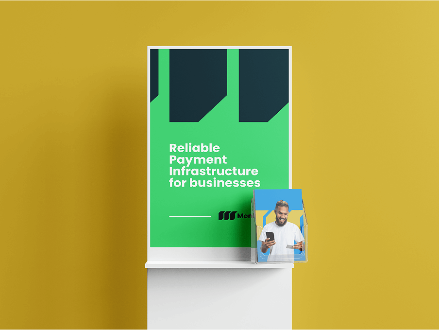
Monibridge provides businesses with a strong, fast, and secure payment corridor, offering a payment infrastructure that other companies can build their products and services on. The brief required a complete visual identity system, including marketing collateral, that could position a technical product as trustworthy and credible in a market where financial infrastructure brands compete on confidence as much as capability.
SOLUTIONS APPROACH
-
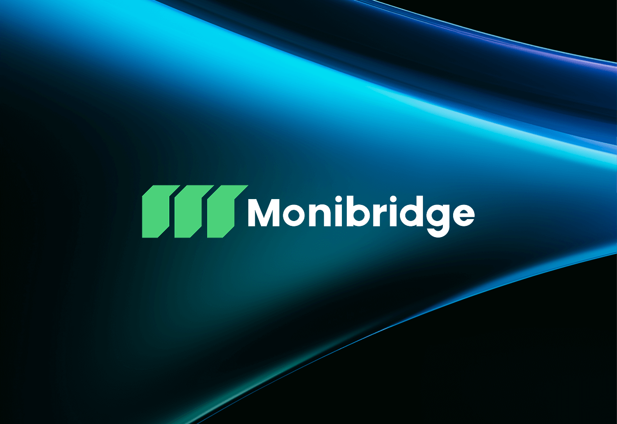
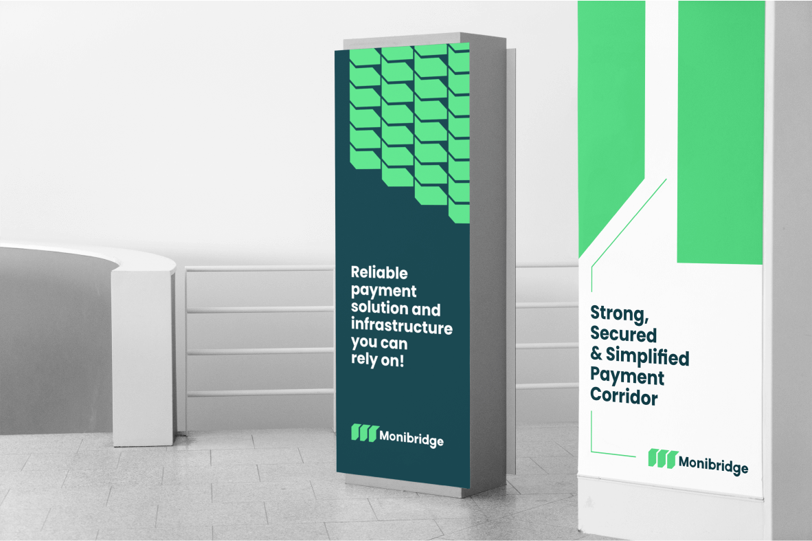
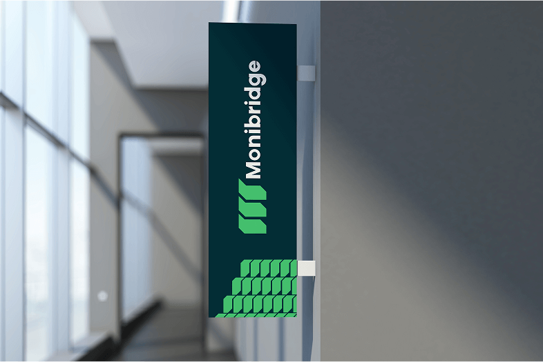
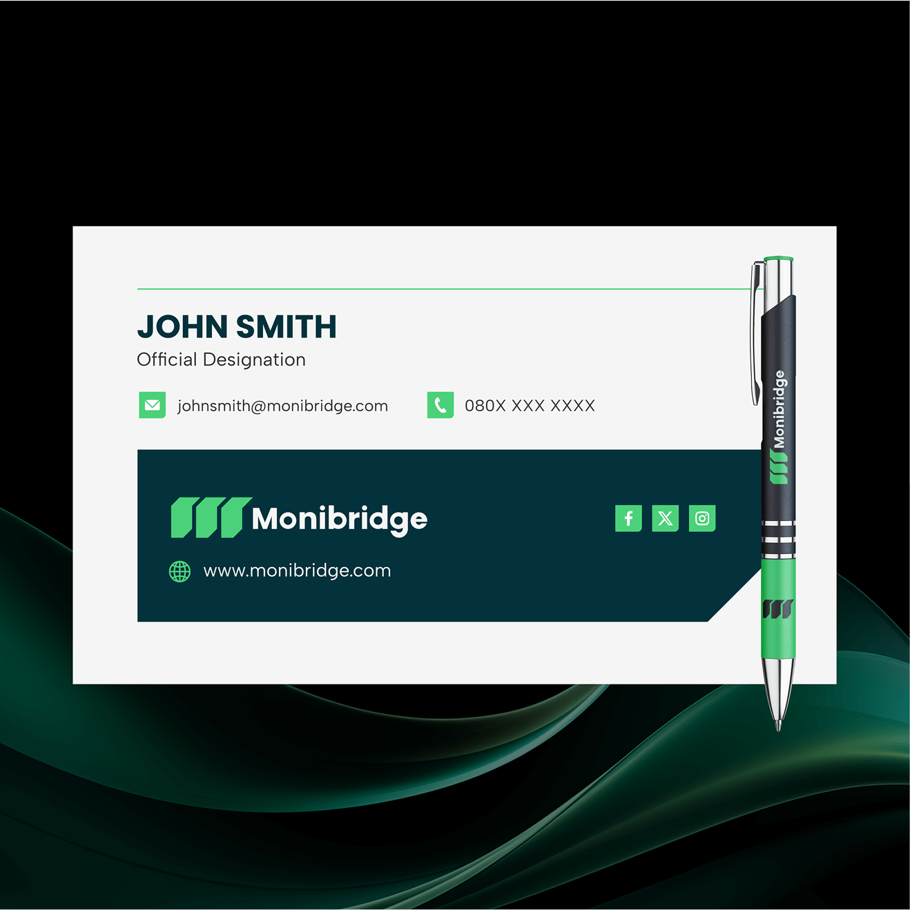
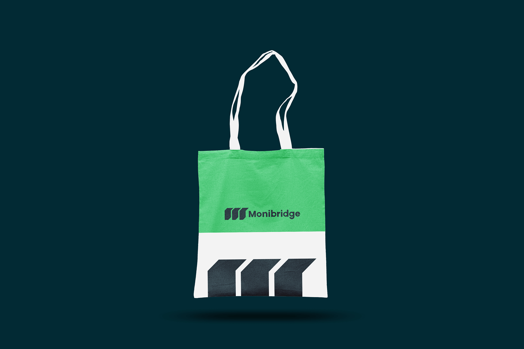
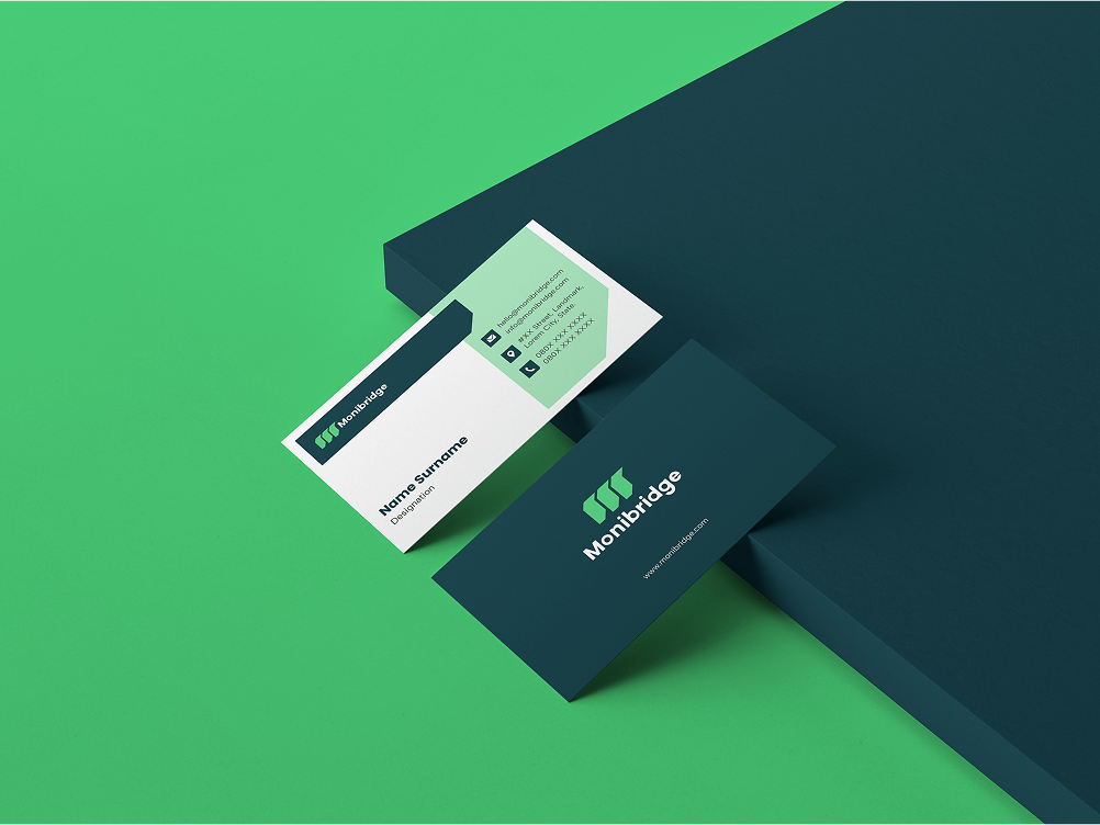
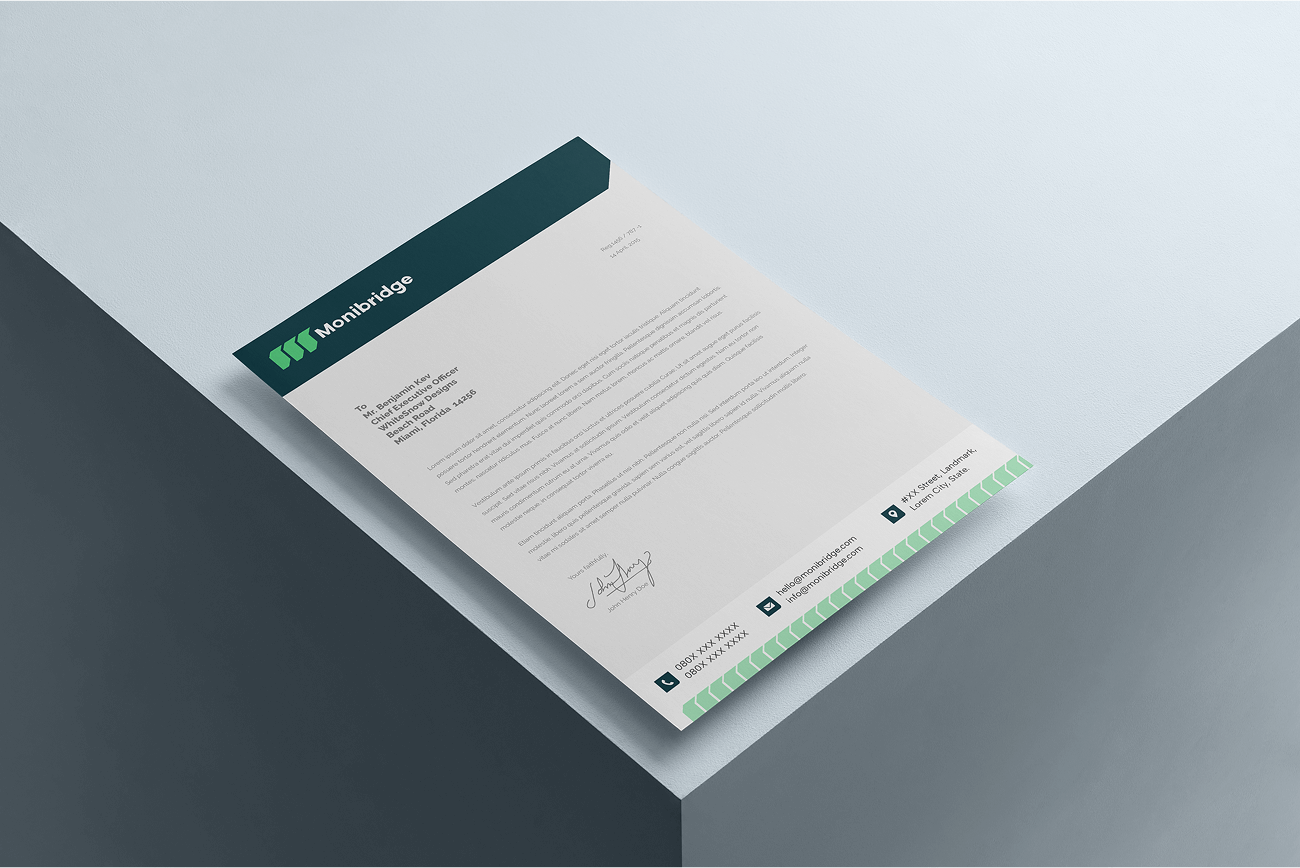
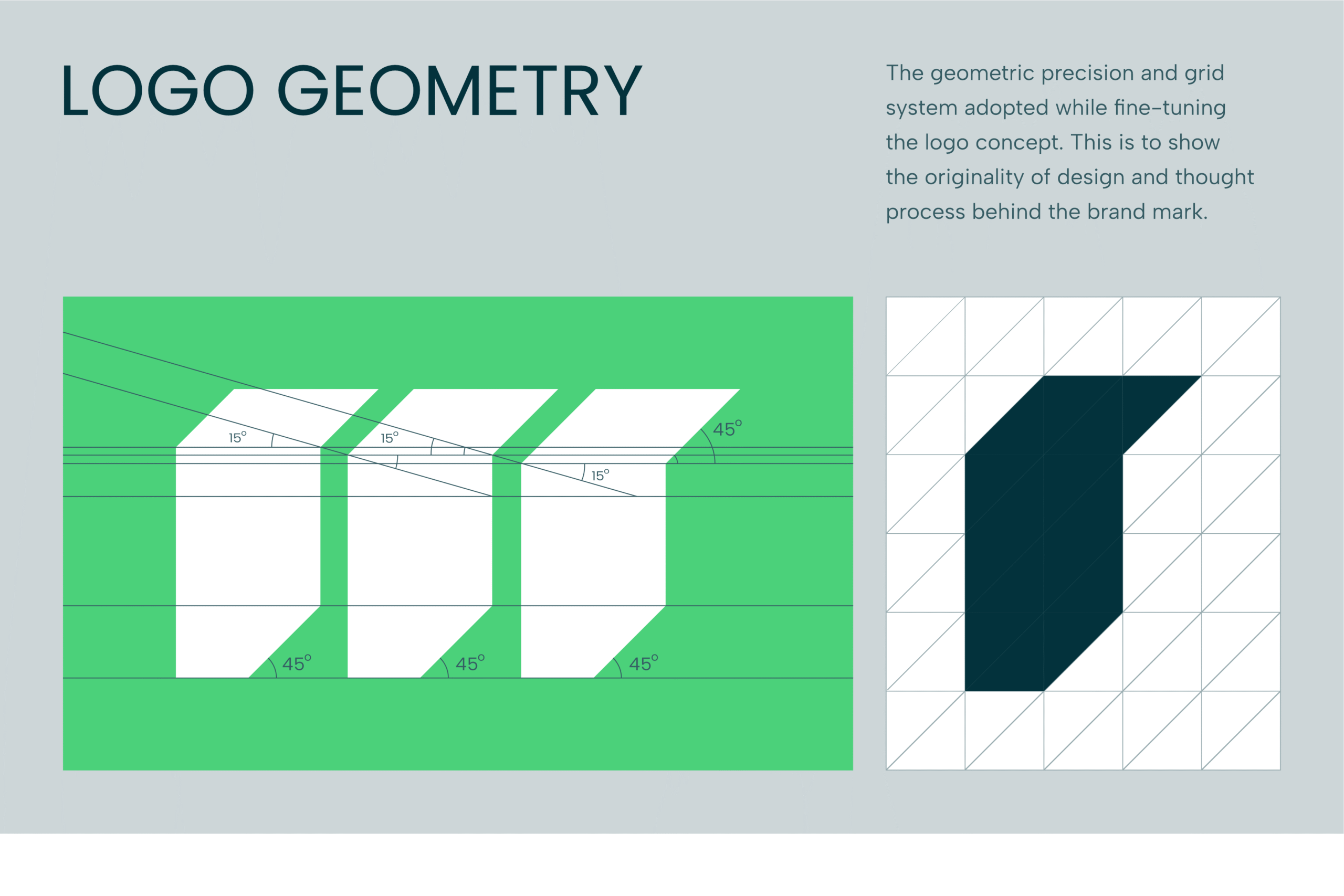
The Monibridge brand is designed as a combination mark with the icon representing the letter M (Monibridge initial). The M is a clever depiction of a bridge, corridors, and "infrastructure." We achieved these subtle depictions by styling the alphabet to take the form of a bridge with decks and support poles.
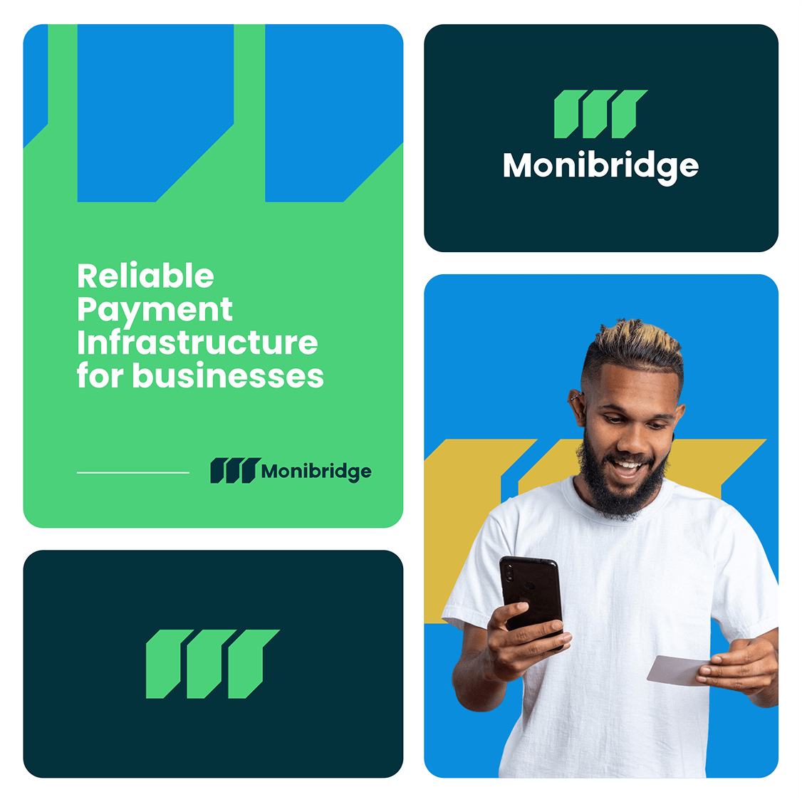
The colour palette was carefully chosen to represent growth (green), trust (blue), and wealth (gold). The typography is a sans-serif typeface that gives the brand a modern feel.