FELTON Energy Services Branding
- Oil and Gas
CLIENT
- FELTON Energy Services Limited
INDUSTRY
- Oil and Gas
SERVICES RENDERED
PROBLEM STATEMENT
-
A parent brand identity for a multi-subsidiary oil and gas group, built to carry a founder’s legacy and serve as the visual foundation for every company it owns.
FELTON Energy Services Limited operates across multiple subsidiaries in the oil and gas sector. The challenge was not simply creating a visual identity for one company: it was developing a parent mark that could carry the genuine legacy and founding principles of the business, function as a credible umbrella identity for all subsidiaries, and communicate the founder’s values without becoming decorative. The brand needed to work as infrastructure, not decoration.
SOLUTIONS APPROACH
-
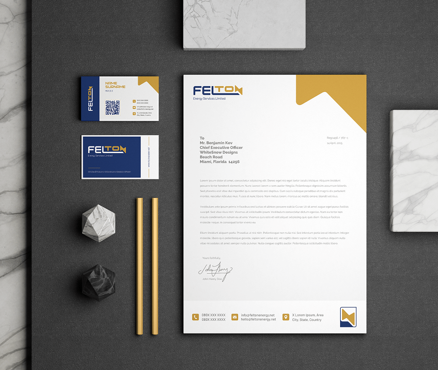
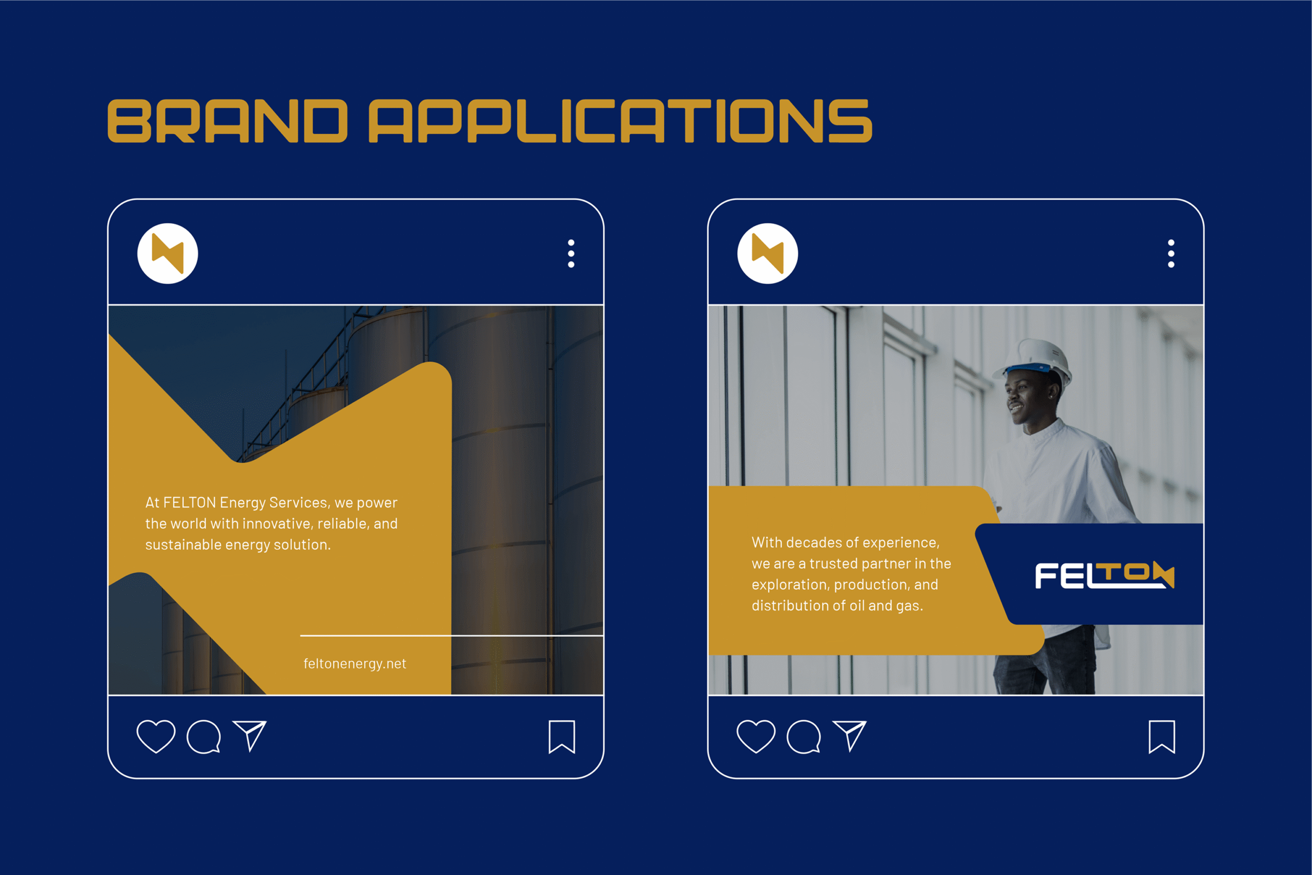
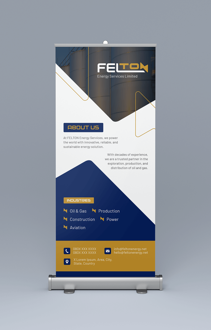
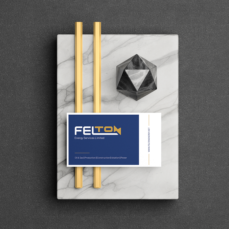
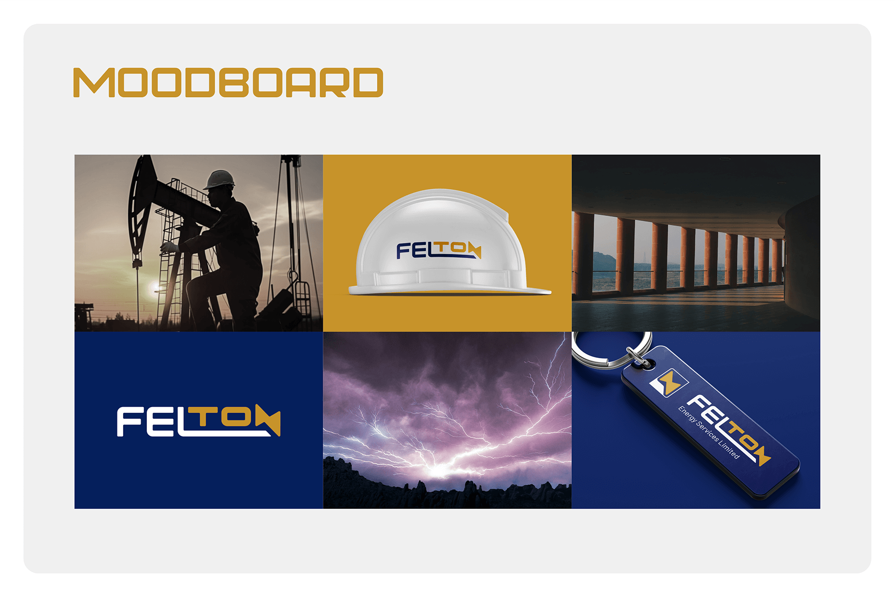
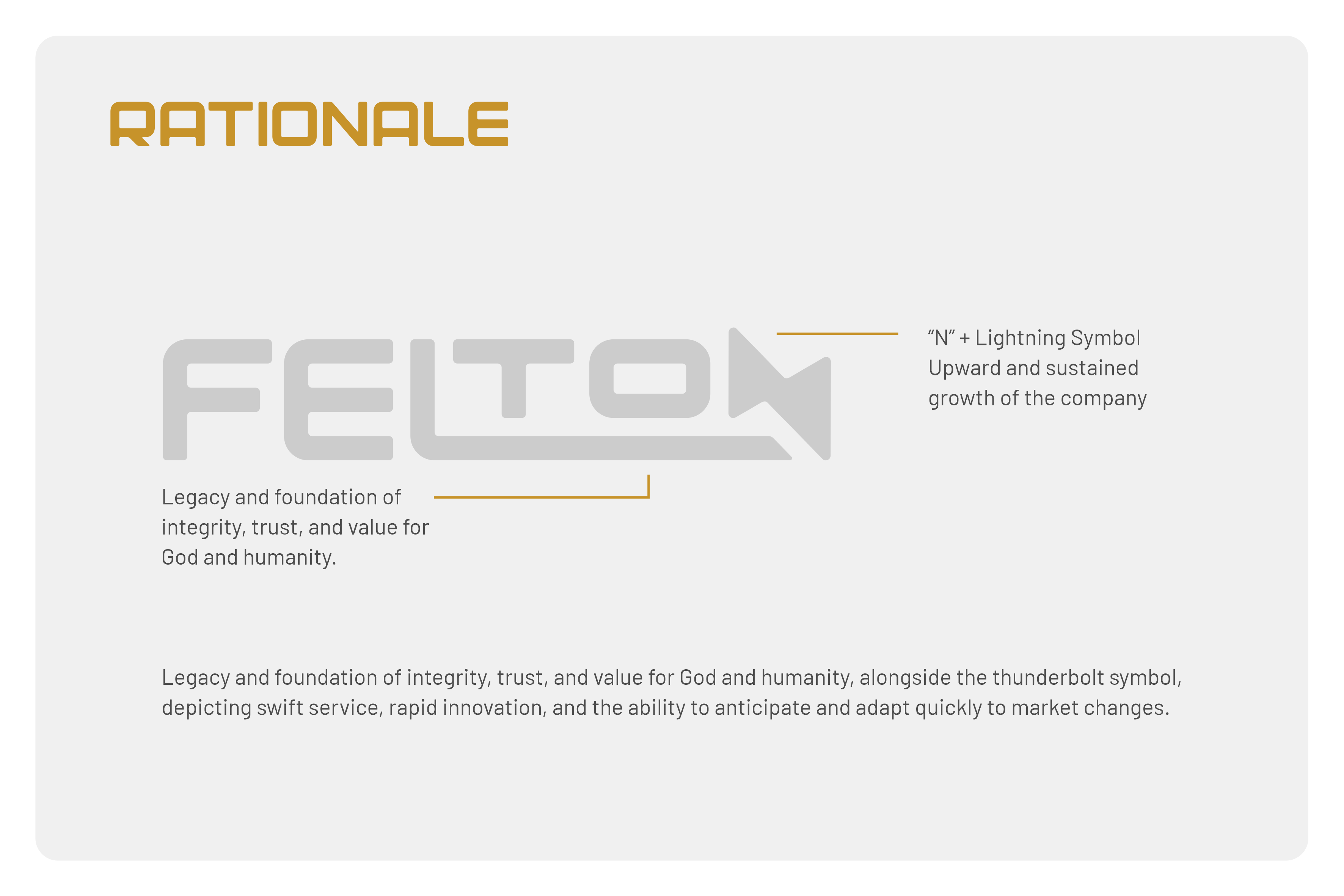
The FELTON wordmark is a bold mark that captures the symbolism of the industry (or class of service) the brand identifies with while cleverly communicating something deeper to the founder. In summary, the wordmark depicts a legacy and foundation of integrity, trust, and value for God and humanity, alongside the thunderbolt symbol, depicting swift service, rapid innovation, and the ability to anticipate and adapt quickly to market changes. The colour palette was carefully chosen to represent trust (blue) and wealth (gold). The typography is a sans-serif typeface that gives the brand a modern feel.