Etrybe Logo
- Real Estate & Tech
CLIENT
- Ivie Omas
INDUSTRY
- Real Estate & Tech
SERVICES RENDERED
PROBLEM STATEMENT
-
eTRYBE is the community version of the mother brand, ETIONARY PROPERTIES. eTRYBE is a global community of real estate professionals, newbies in the field, and HNIs. The brand is a property-tech platform that allows its members to "become a realtor from the comfort of their home." In other words, it is going to be web-based such that people can access the platform via their PCs and the mobile app.
SOLUTIONS APPROACH
-
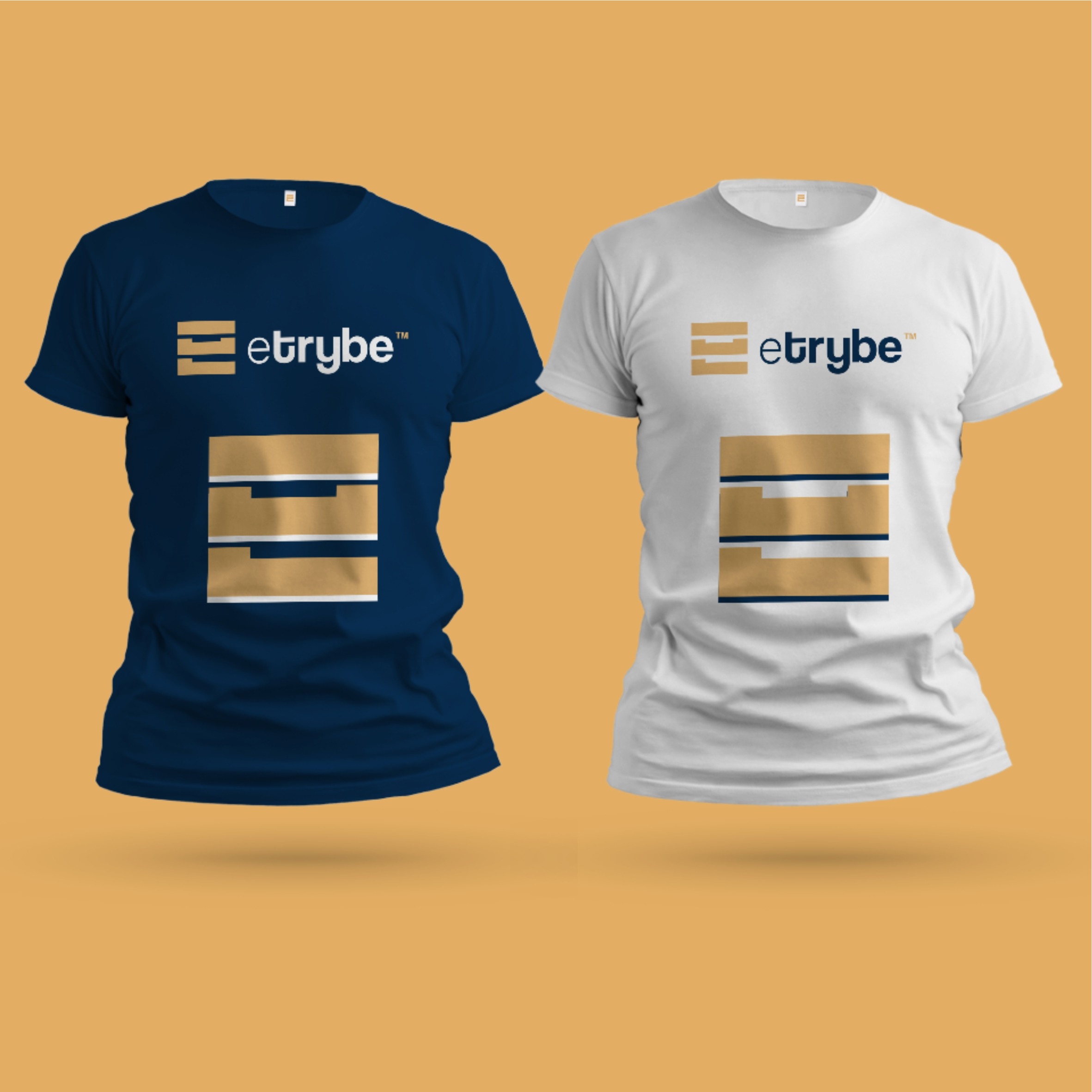
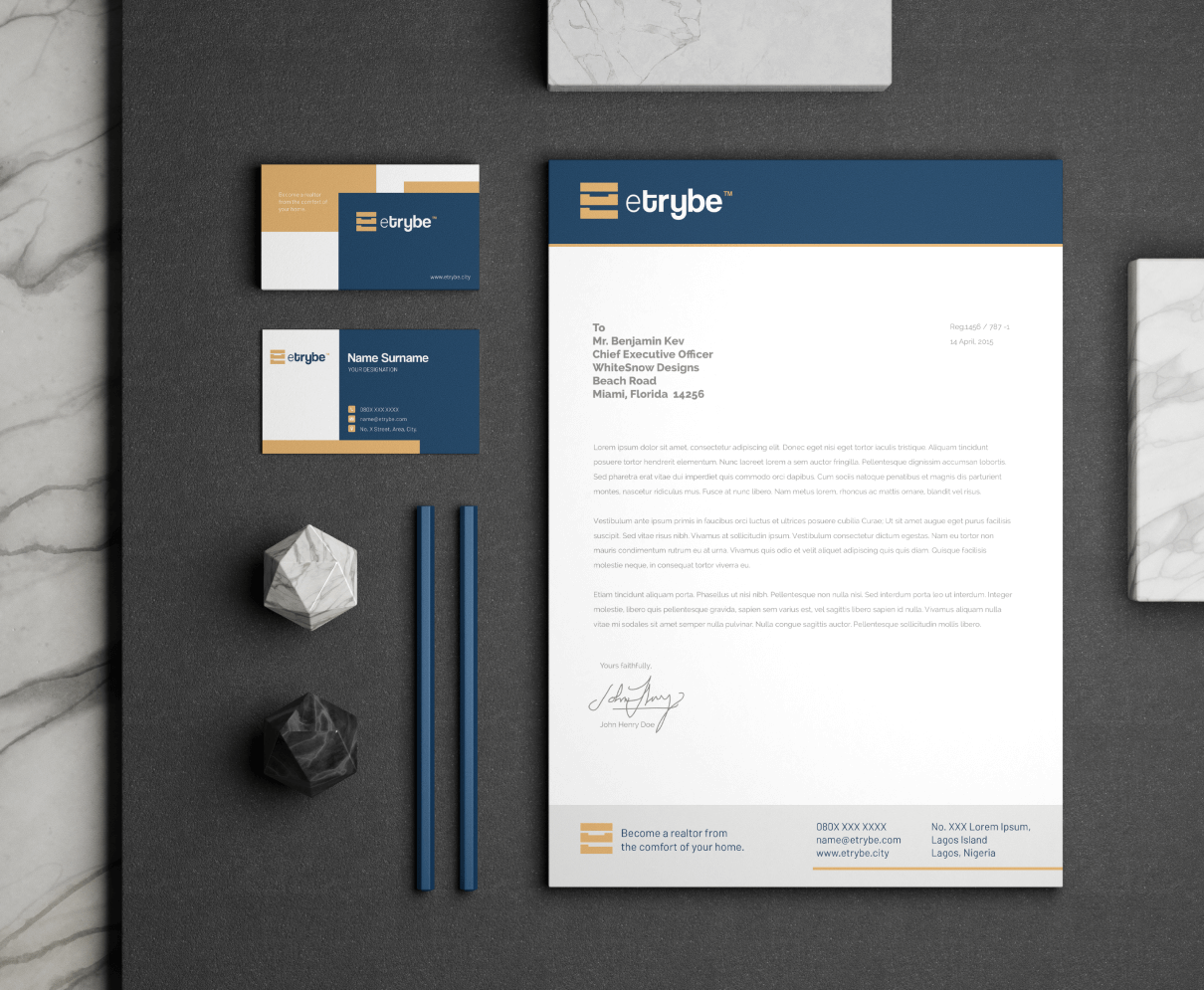
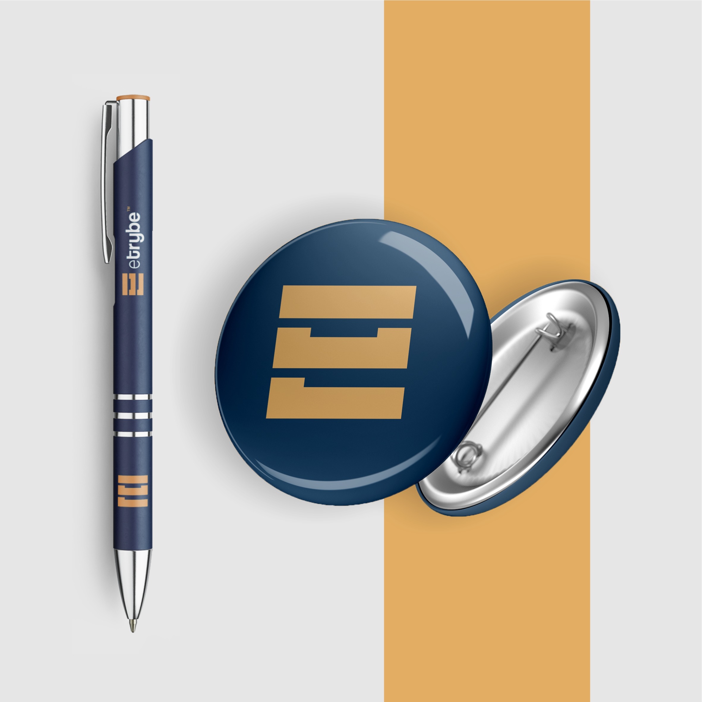
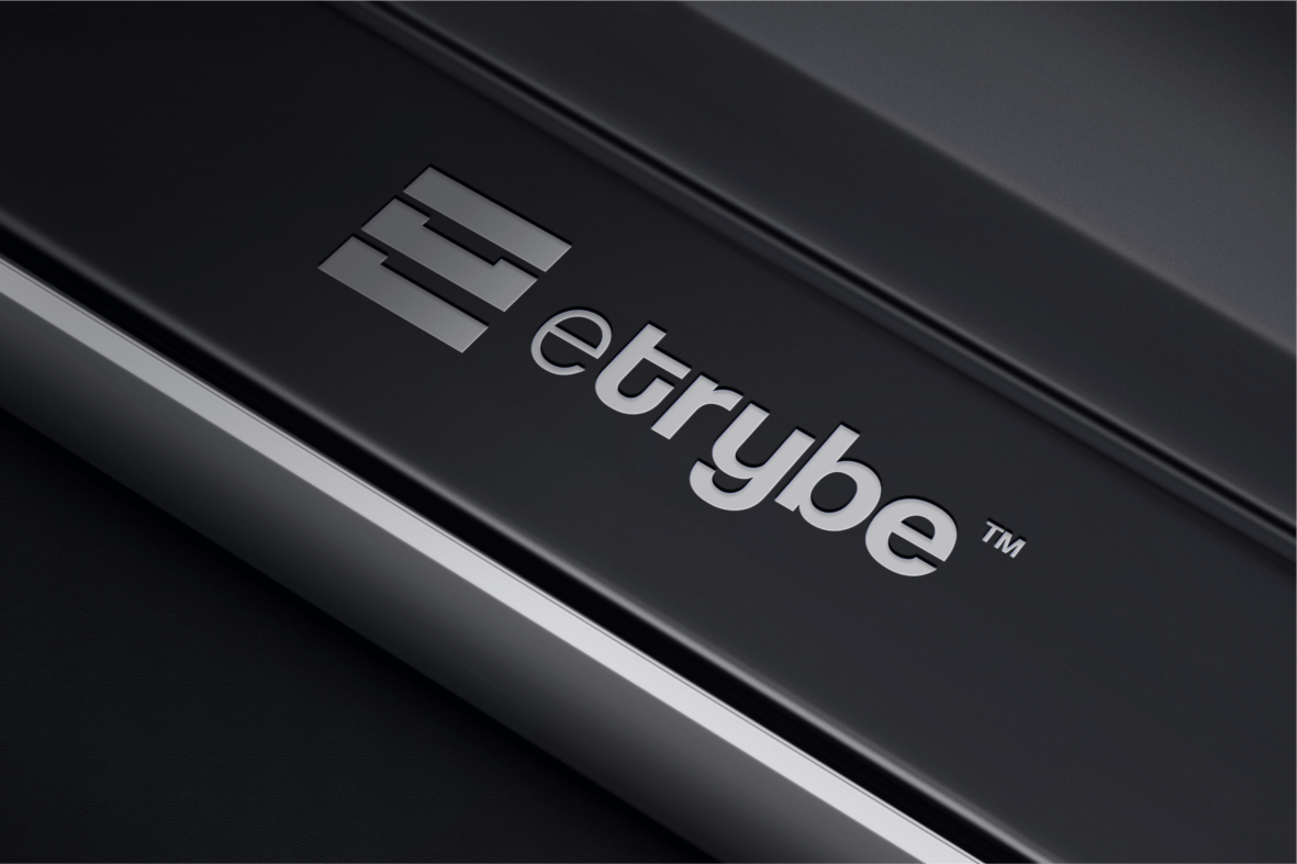
In ideating the logo, we used the brand metaphors such as 'connectivity' and 'building'. We came up with a relatable concept with the letter “e.” Looking at the icon mark, you can see three shapes combined like a building block to form the letter “e.” This, for us, talks about connectivity, building, and growth. It sums up everything the brand stands for, right at its core. We carefully chose the colours to depict professionalism (blue) and royalty (gold) in line with the brand positioning.
