Fedzim Logo Design
- Information Technology
CLIENT
- FedZim
INDUSTRY
- Information Technology
SERVICES RENDERED
- Brand Discovery Session
- Competitive Landscape Analysis
- Target Audience Profiling
- Logo Ideation
- Colour & Font Psychology
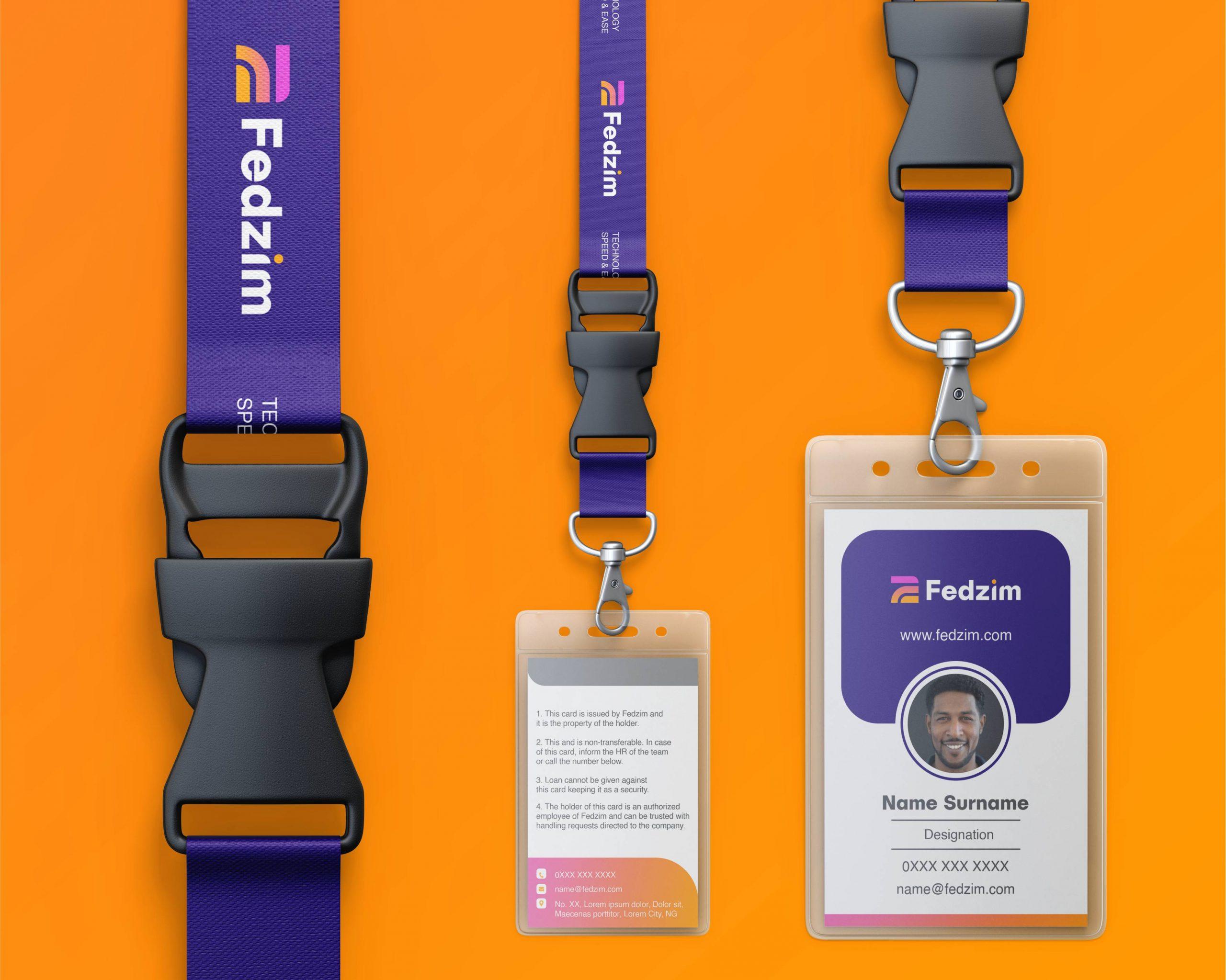
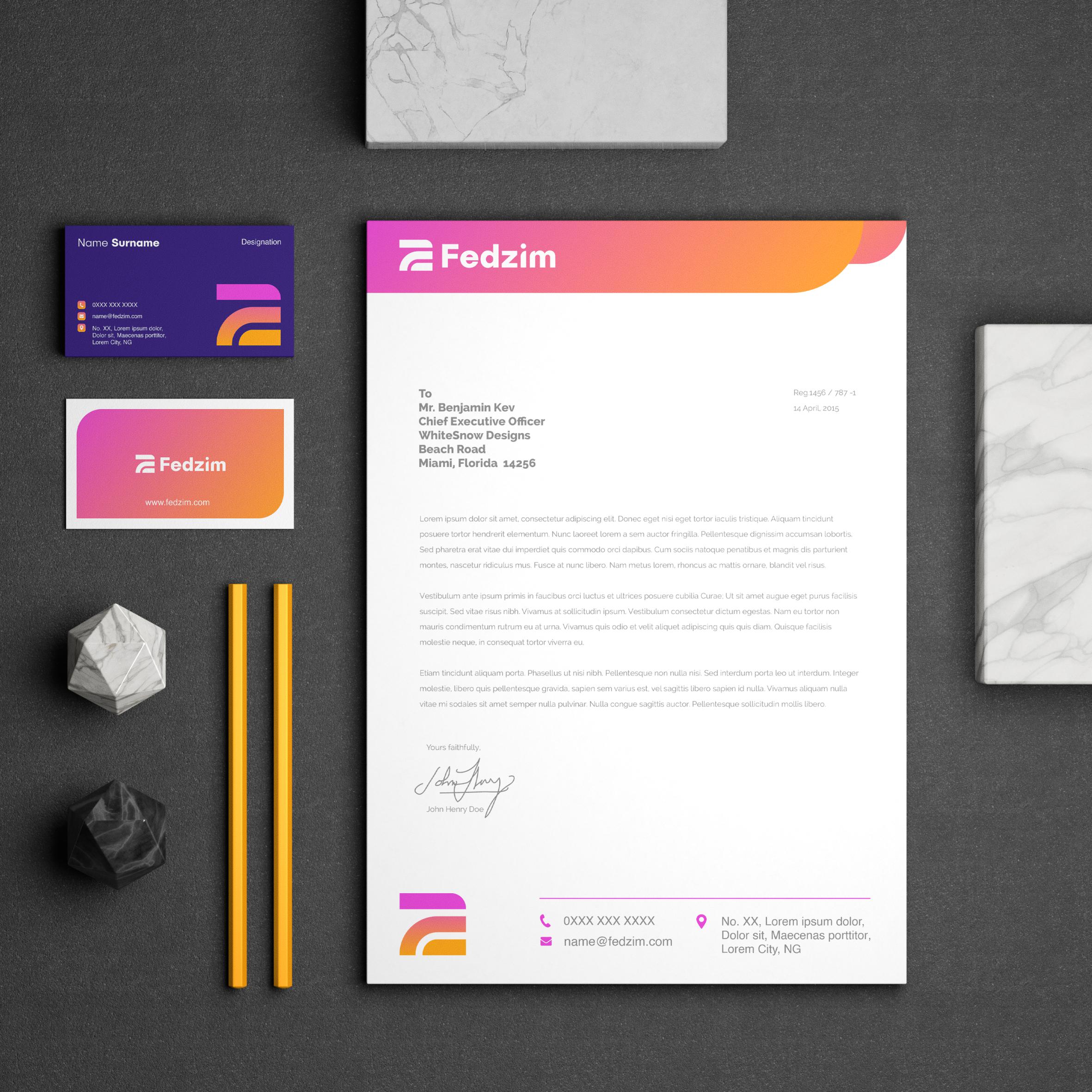
- Stationery Designs & Mockups
PROBLEM STATEMENT
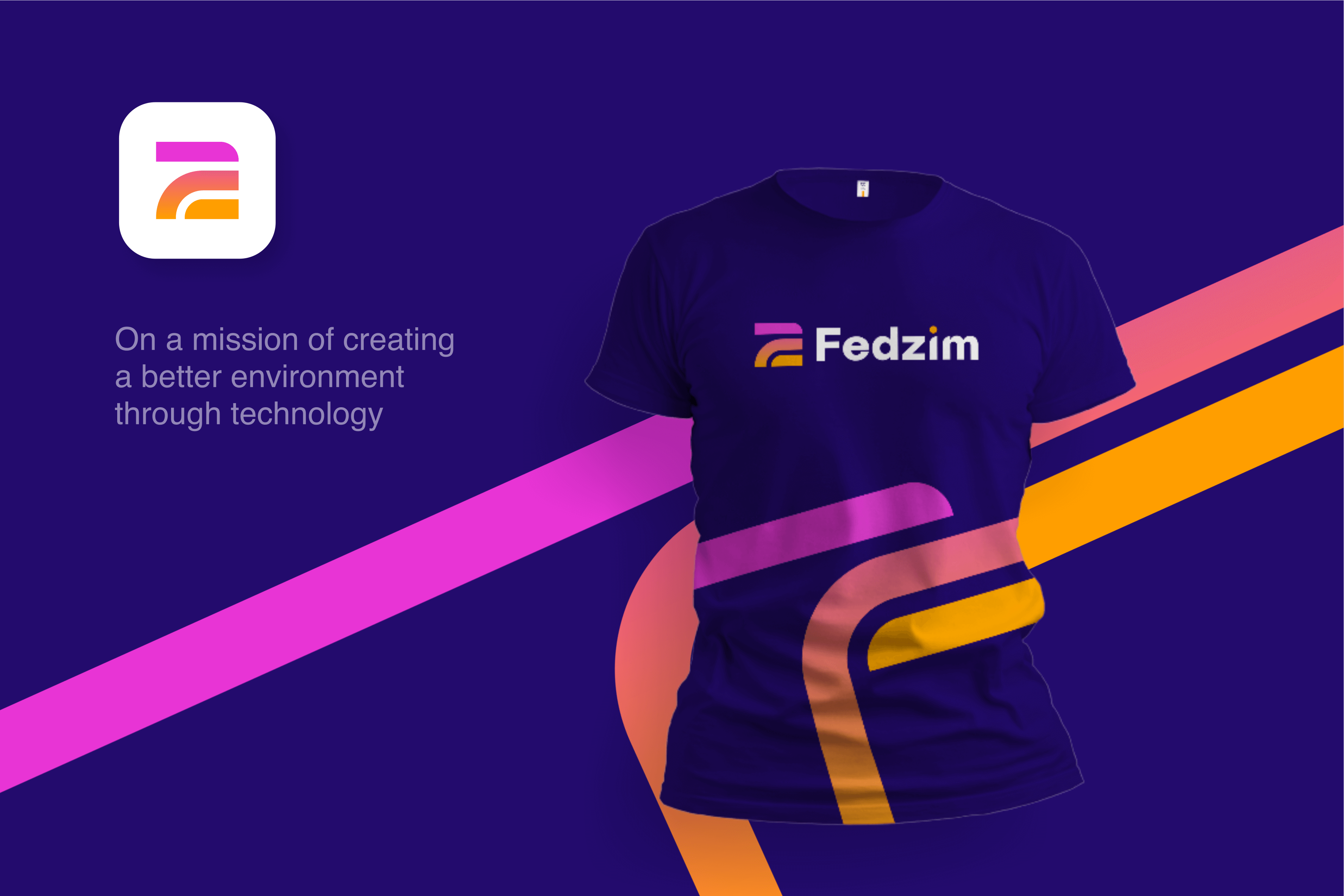
- FedZim is a tech brand owned by two co-founders whose names formed the brand name (FedZim). We were given an assignment to create an identity that symbolizes “having a better environment through technology”, and “finding better and easier ways of doing things.”
SOLUTIONS APPROACH
- In the course of drafting the identity, we stumbled on the idea of blending the initials, F and Z to form three road paths - a symbolism of “finding better and easier ways of doing things.” We used the arrangement of the colour gradient [Yellow-Purple] to depict "the rising sun" which helps to symbolize "a better environment". Typography: Sans Serif [Publica Sans/Helvetica] (modern, friendly, minimal, youthful and contemporary). Colours: Blue (Trust, Strength, Professionalism), Light Purple (Creativity, Royalty), Yellow (Happiness, Enthusiasm).


FEEDBACK FROM CLIENT
All I can say is that you did a thorough ideation work here! As simple as it looks, you captured a lot in it. Thank you very much for the professionalism.
FedZim
