Merite’s Kitchen Visual Identity
- Food and Hospitality
CLIENT
- Merite's Kitchen
INDUSTRY
- Food and Hospitality
SERVICES RENDERED
PROBLEM STATEMENT
-
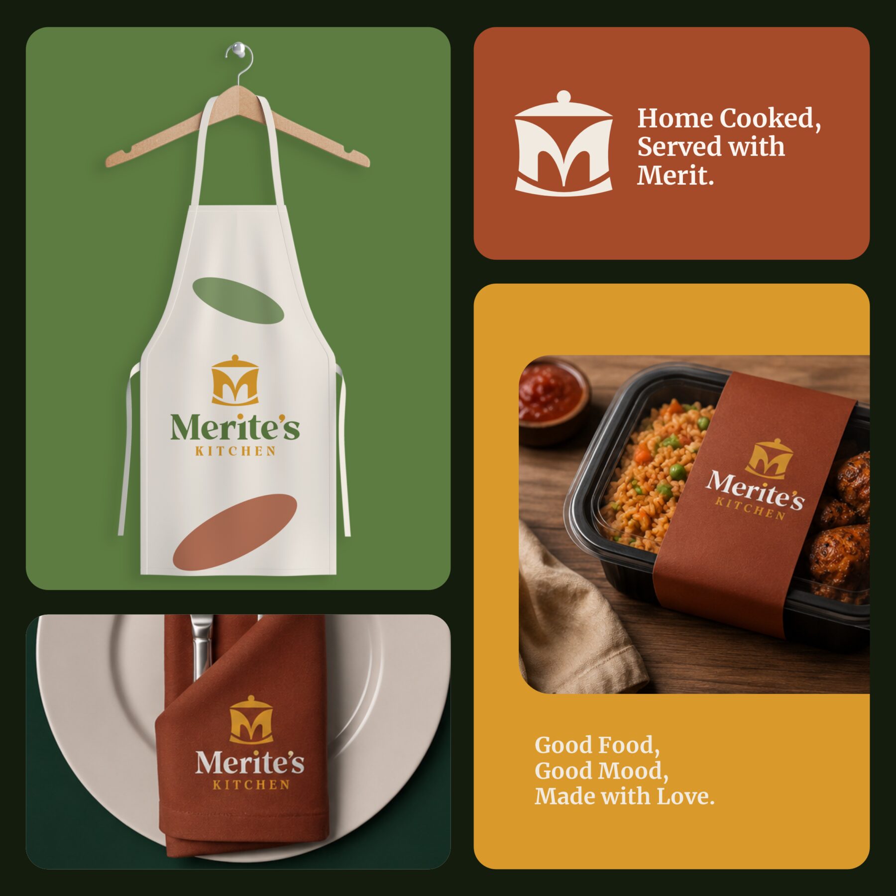
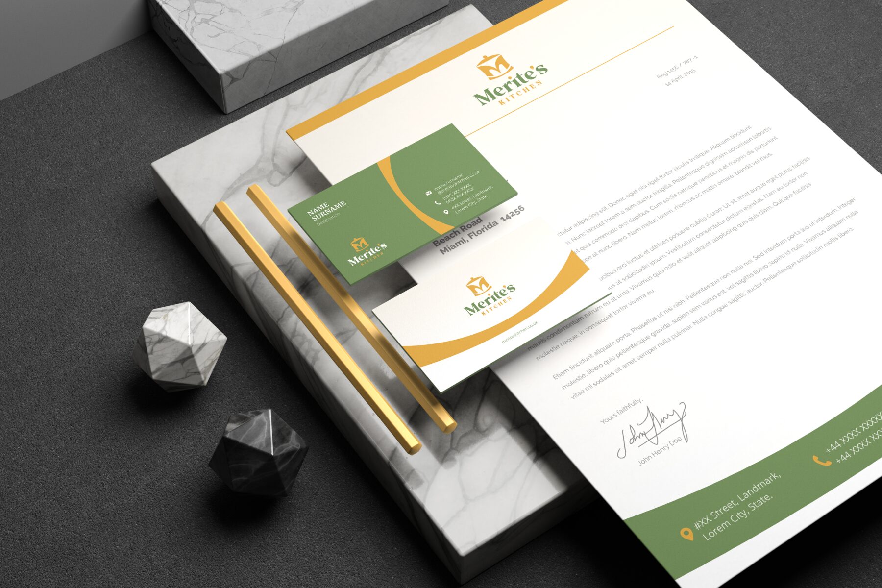
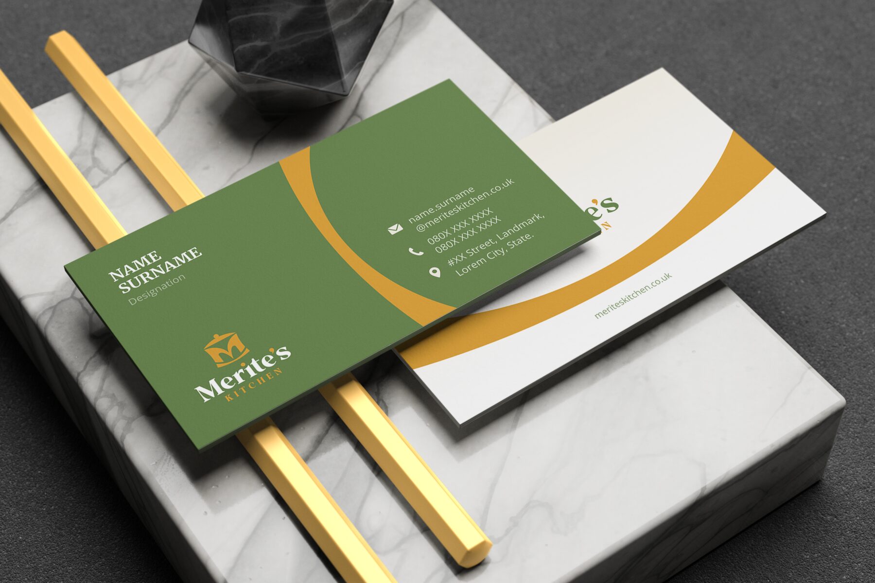
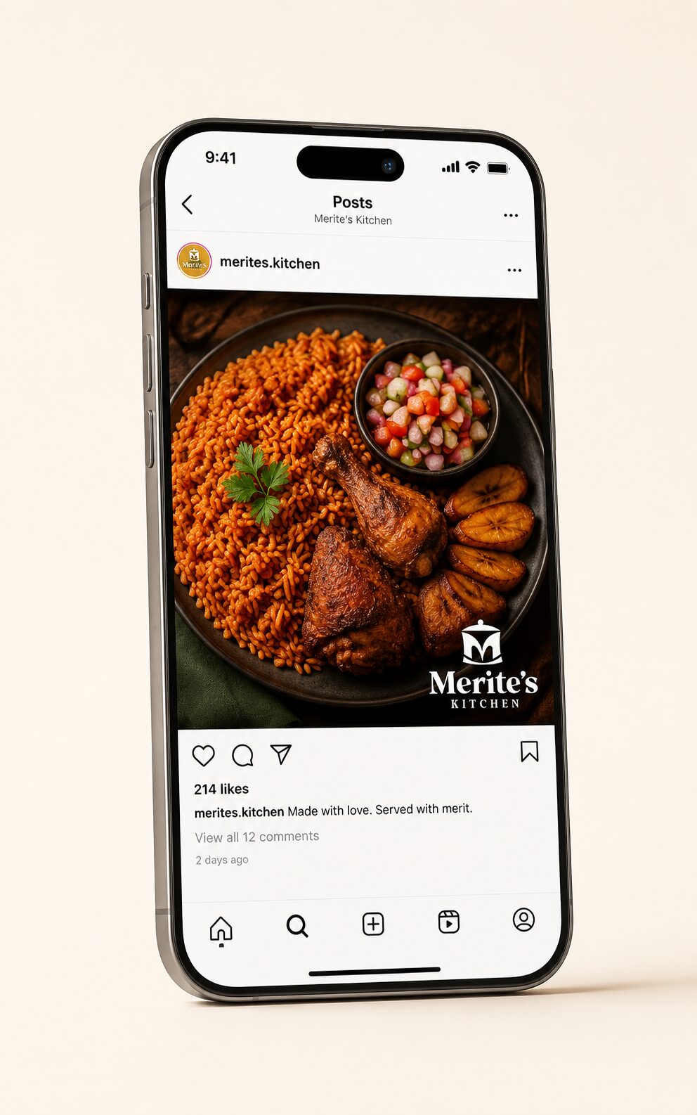
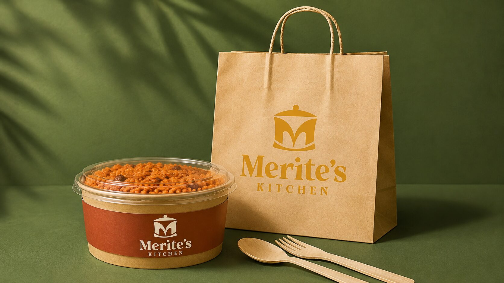
Merite’s Kitchen competes in a crowded UK market for Nigerian food where most operators look and feel the same. To justify a premium price and build real loyalty, the brand needed a visual identity that read as authentically Nigerian, personally warm, and genuinely premium all at once, not a generic food-brand look borrowed from elsewhere, and one that could hold up consistently across packaging, stationery, and digital touchpoints.
SOLUTIONS APPROACH
-
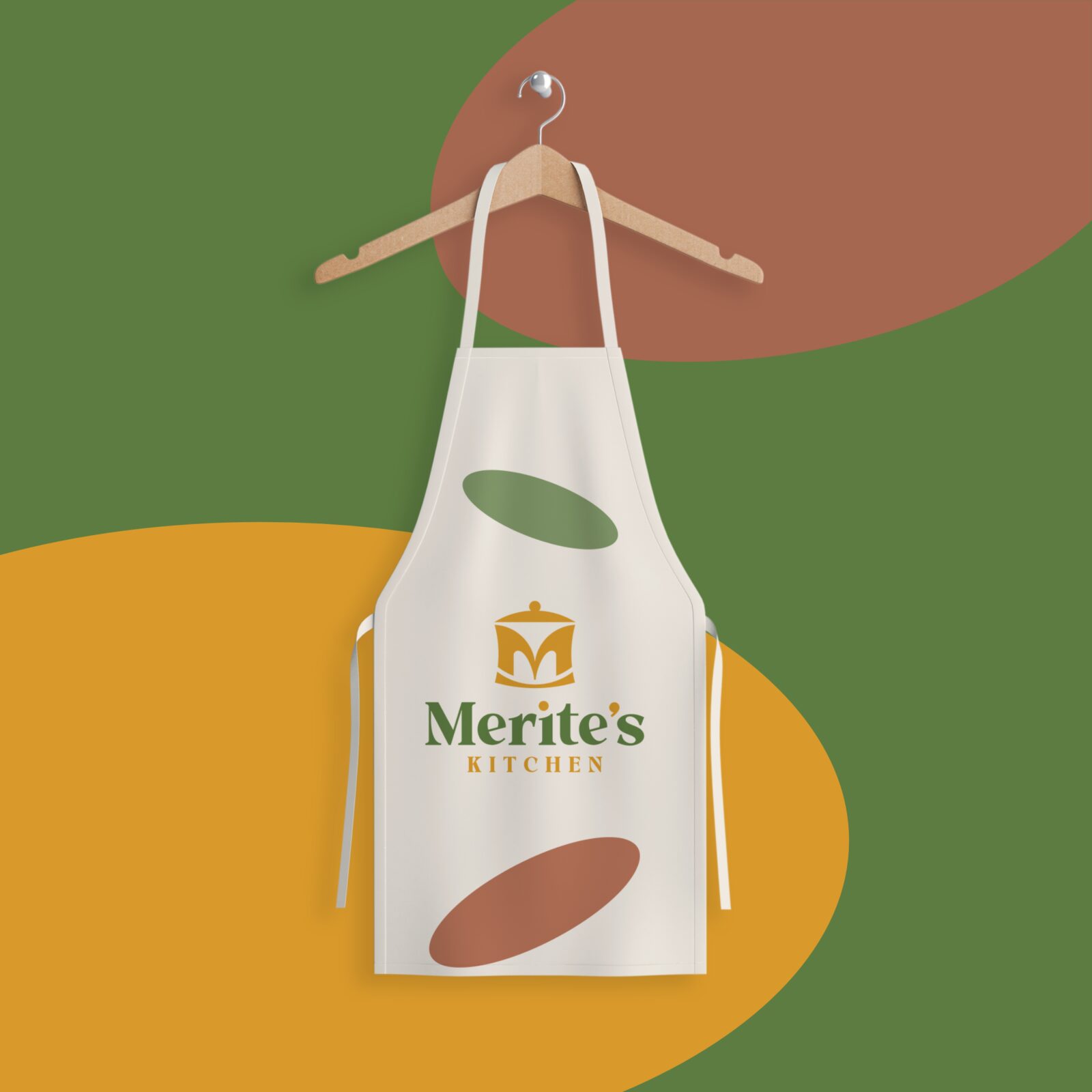
The logo resolves this in a single dual-meaning mark: a cooking pot lid, opened slightly, forms the letter M for Merit, the founder’s name, so the identity reads as food and warmth at a glance and as personal ownership on closer look. The palette (Harvest Gold, Fern Green, Rusty Spice) is drawn directly from Nigerian cooking itself, palm oil, fresh vegetables, and slow-cooked stew, making the brand feel immediately familiar to its audience while reading as premium rather than informal. A warm serif for “Merite’s” paired with spaced small caps for “KITCHEN” carries that same balance of craft and confidence across every touchpoint, from packaging to the founder’s apron.